Design Tips
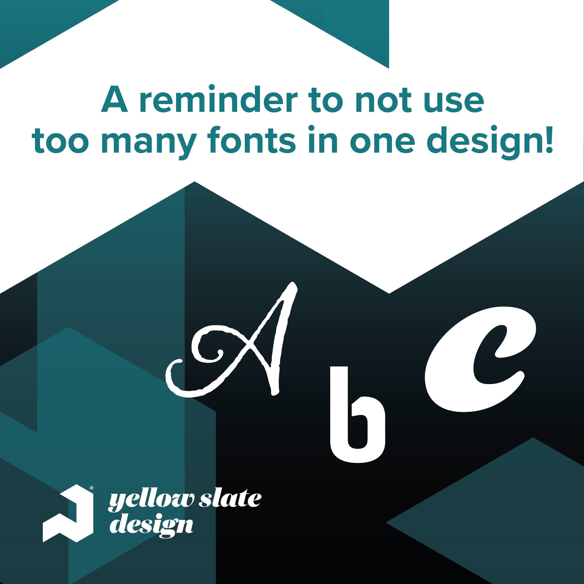
1) Fonts
Using too many fonts can make it difficult to understand the design. Fonts create a visual representation of your brand so it’s important to keep them to a minimum, making your brand more recognisable for customers.
2) Choosing a website designer
Some things to keep in mind when choosing someone to build and design your website:
1) What experience have they had?
2) Are they quality focused?
3) Do they take security into account?
4) Can they adapt to your needs?
5) Can you rely on them?
You can definitely rely on us send us a message or email: info@yellowslatedesign.com
3) Choosing colours
A great tip for graphic designers is to use a consistent colour palette throughout your design. In most instances, it's more visually pleasing than extreme contrast.
4) White Space
The power of white space. People can misinterpret the use of white space as ‘boring’ and ‘lazy’, but any designer knows how important it is! There are different types of white space, which should be used in different instances.
5) Lettering
Letter spacing is really important as not only does it improve readability, but gives different looks and feels to a design. Evaluate how close/far away your letters are away from each other, and if the text is easy to read.
6) Alignment
You should pay attention to detail when it comes to alignment in your designs. If something is out of place, it can completely change the viewer's perception of the piece.


